When DocReady hired us they were driving traffic to a budget website with Google Ads. Their average cost to acquire a new customer through this model was $75 and far from being profitable based on their pricing model.
The problem was immediately obvious to us – they were running paid traffic to a website that had fundamental issues with design, copy, and functionality. They had made the mistake of hiring a budget web design agency and they were losing thousands of dollars a week because of it – and far more in lost opportunity cost.
Web UX Design
Here’s a look at the initial wireframe we created for the new home page with a version 1 of new sales copy and more interactive conversion points.

A lot of time was spent on discussions around the calls to action, sign up flow, and making it easy for people to see the services they are most interested in.
Web UI Design
For the actual UI design we proposed the idea of staying away from the classic blue color scheme of the medical industry.
There’s a lot of competition in the virtual healthcare space. Many of them have very talented teams and deep pockets. It’s important for DocReady to not blend in and look like everyone else. They can’t compete dollar for dollar in the early stages – the differentiation has to be in design, personality, and offer.
We went super clean with the design and a light warm color scheme. The bright orangey action color ensures that buttons and links are obvious to visitors.

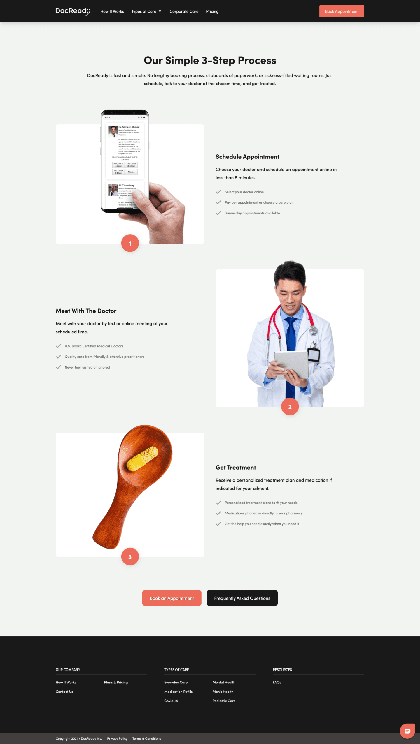
The next thing we wanted to do was address the the fact that virtual healthcare is a new concept to a lot of people. We designed a How It Works page to help people clearly understand the process before signing up.
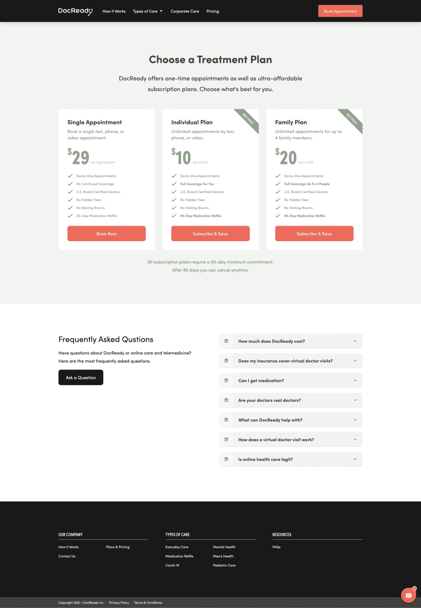
The next task was to make sure the pricing page was clean and simple and that the pricing was displayed in a manner that would make sense at a glance. We didn’t want visitors to have to decipher the pricing or spend a lot of time considering their options.
One of the bigger challenges was with the sign-up flow. DocReady isn’t licensed to provide care in every state. They can only serve people in specific states.
However, we didn’t just want to turn down people who aren’t in licensed states. So, we designed an interstitial screen within the sign-up flow that would ask the visitor what state they’re in:
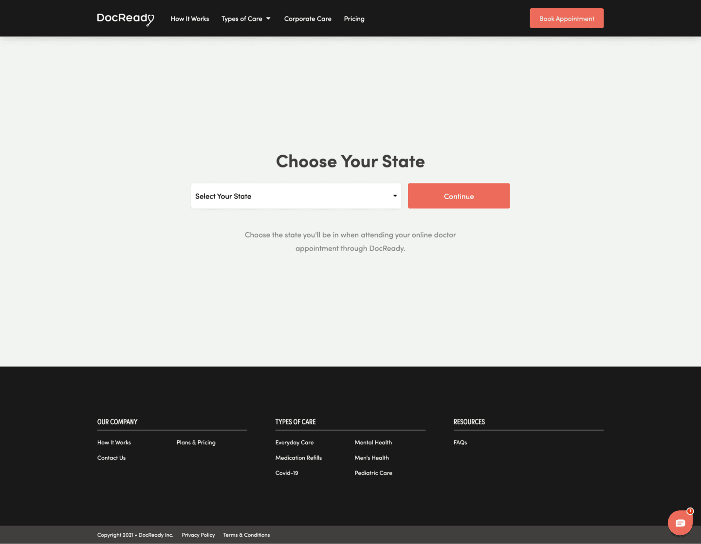
If the visitor is in a licensed state, they are taken to the registration page. If a visitor is in an unlicensed state, they’re taken to a waiting list sign-up so we can still collect their email address.
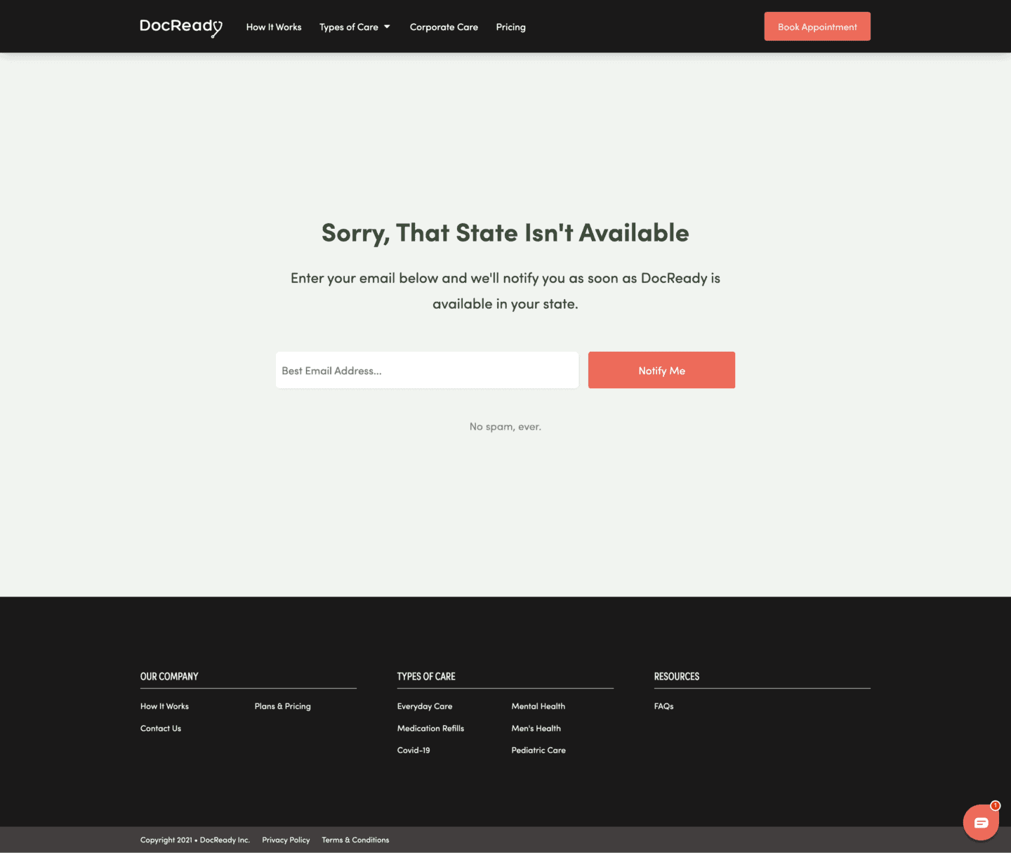
This accomplishes two important tasks. First, it shows DocReady where demand is so they can focused on getting licensed in high-demand states faster. Second, it builds a healthy waiting for DocReady so when they gain licensing in a new state, they can immediately contact interested prospects in that state and generate sign-ups.
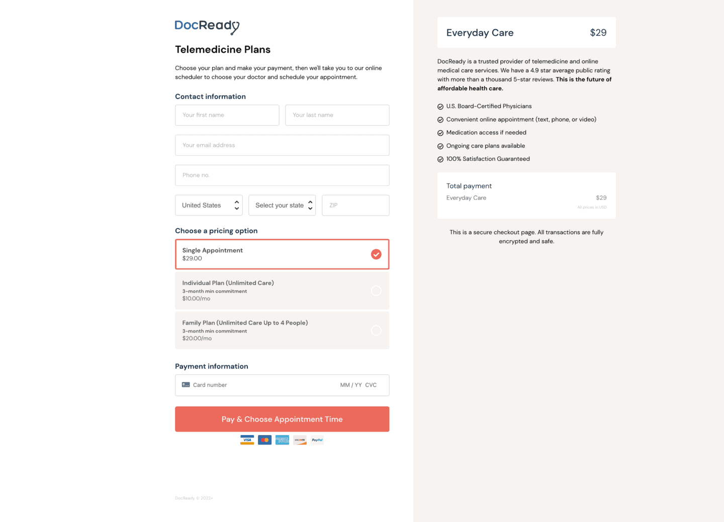
We also setup the checkout and payment processing system for DocReady, featuring automatic plan selection (based on the option they chose in the pricing table) while still allowing the visitor to change the plan directly inside the checkout.
Results
The new web design, sign-up flow, and checkout process dramatically increased traffic and conversions. After taking over their PPC management we were able to cut their overall acquisition costs by 73%, from $75 per new customer to an average of $10 and $20 per new customer.
